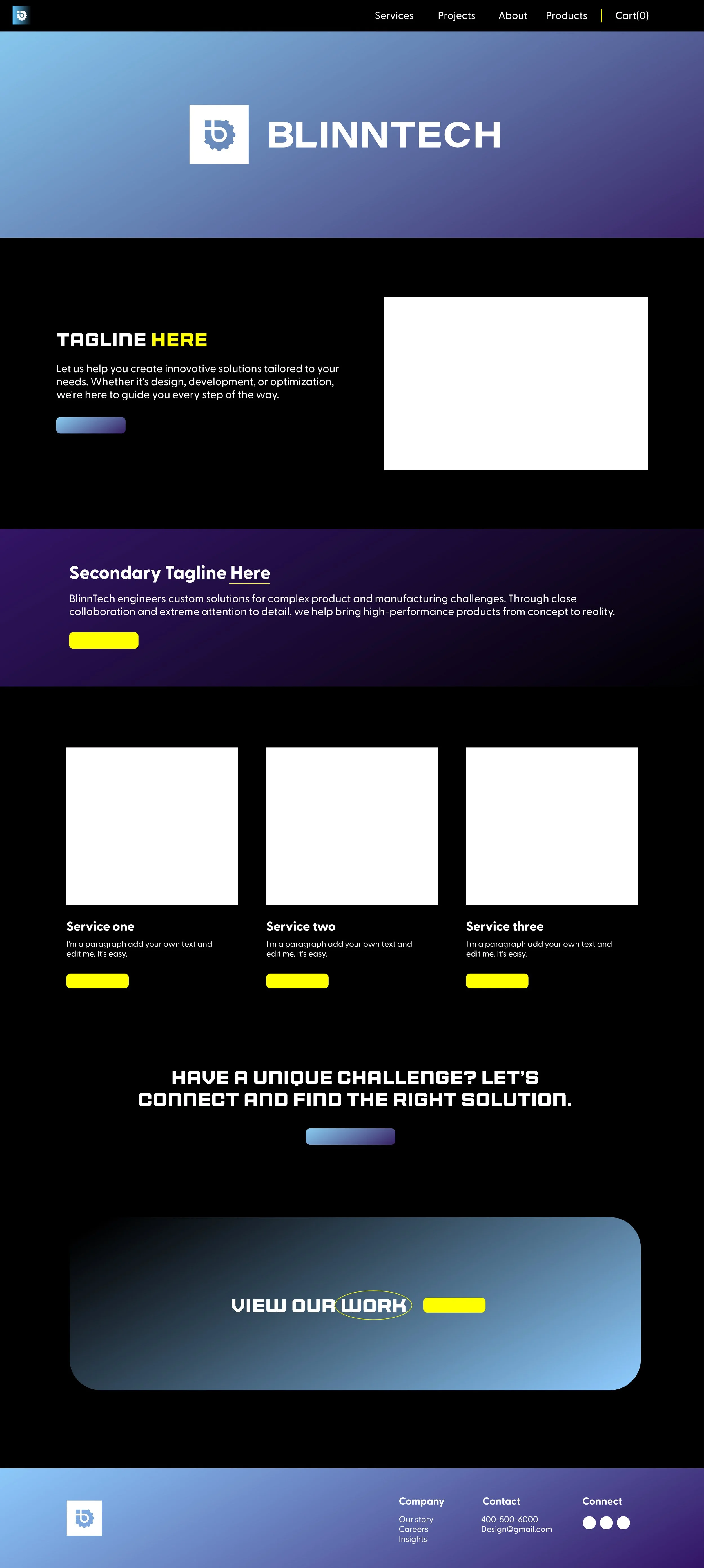
BlinnTech Branding & Web
I designed all assets for BlinnTech, an engineering firm in Minnesota, including logos, color palettes, wireframes, and image treatments. My goal was to create a fresh and readable design while breaking away from traditional “engineering design” norms. Each decision was carefully considered to reflect the brand’s identity and establish BlinnTech as a reliable and elite engineering company.


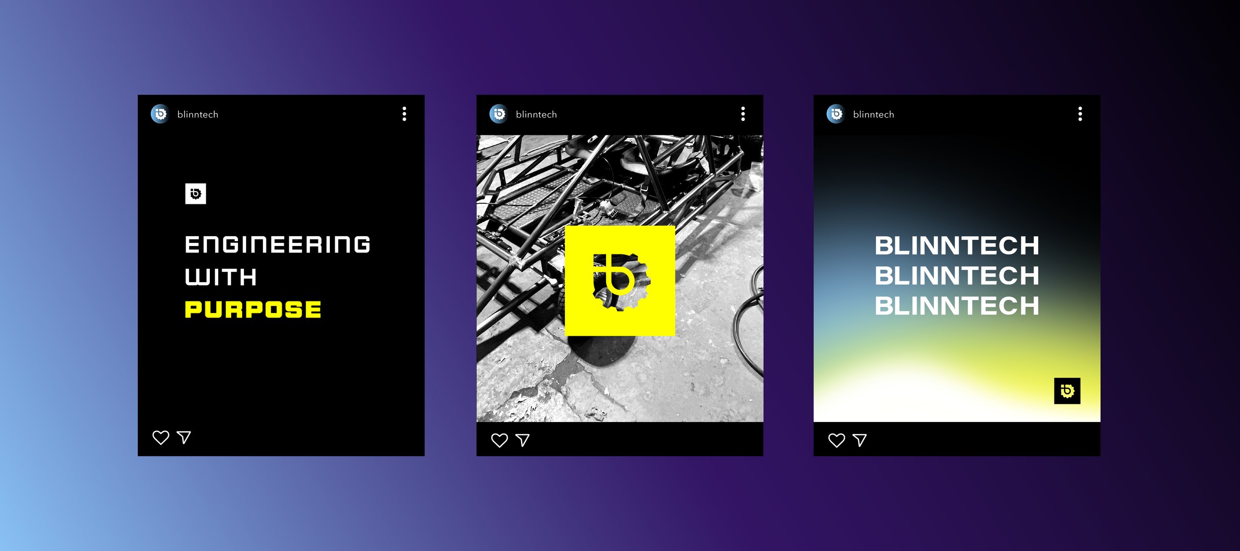
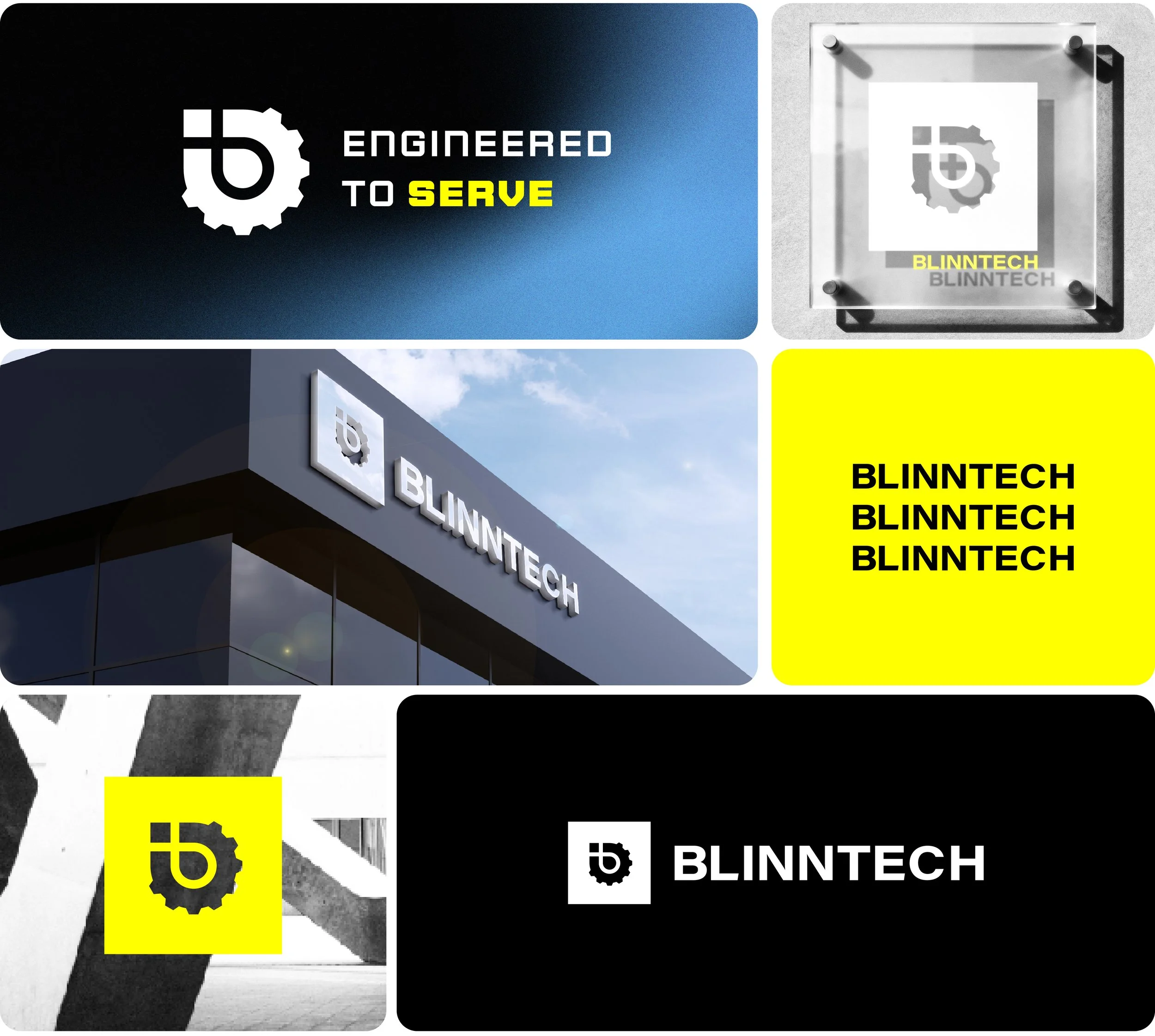
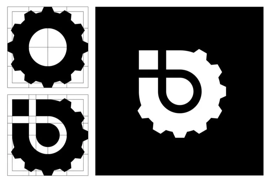
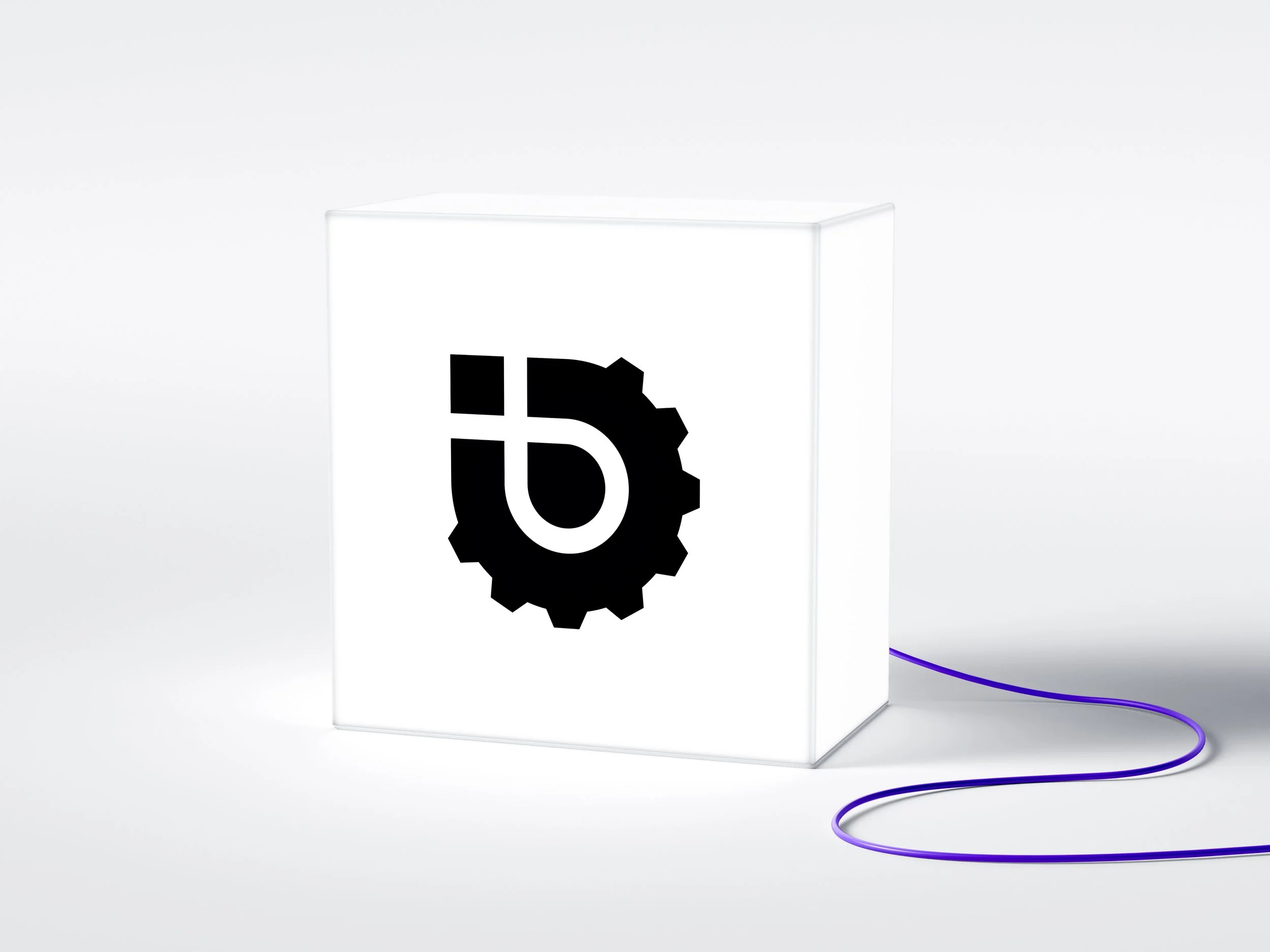
The BlinnTech logo is a complete expression of their identity. Designed with versatility in mind, it reflects the wide range of engineering challenges they solve—serving as a true “Swiss Army knife” of possibilities.
Subtly embedded within the design are the B, cross, gear, and Christian fish, symbolizing mechanical precision, purpose, and faith.
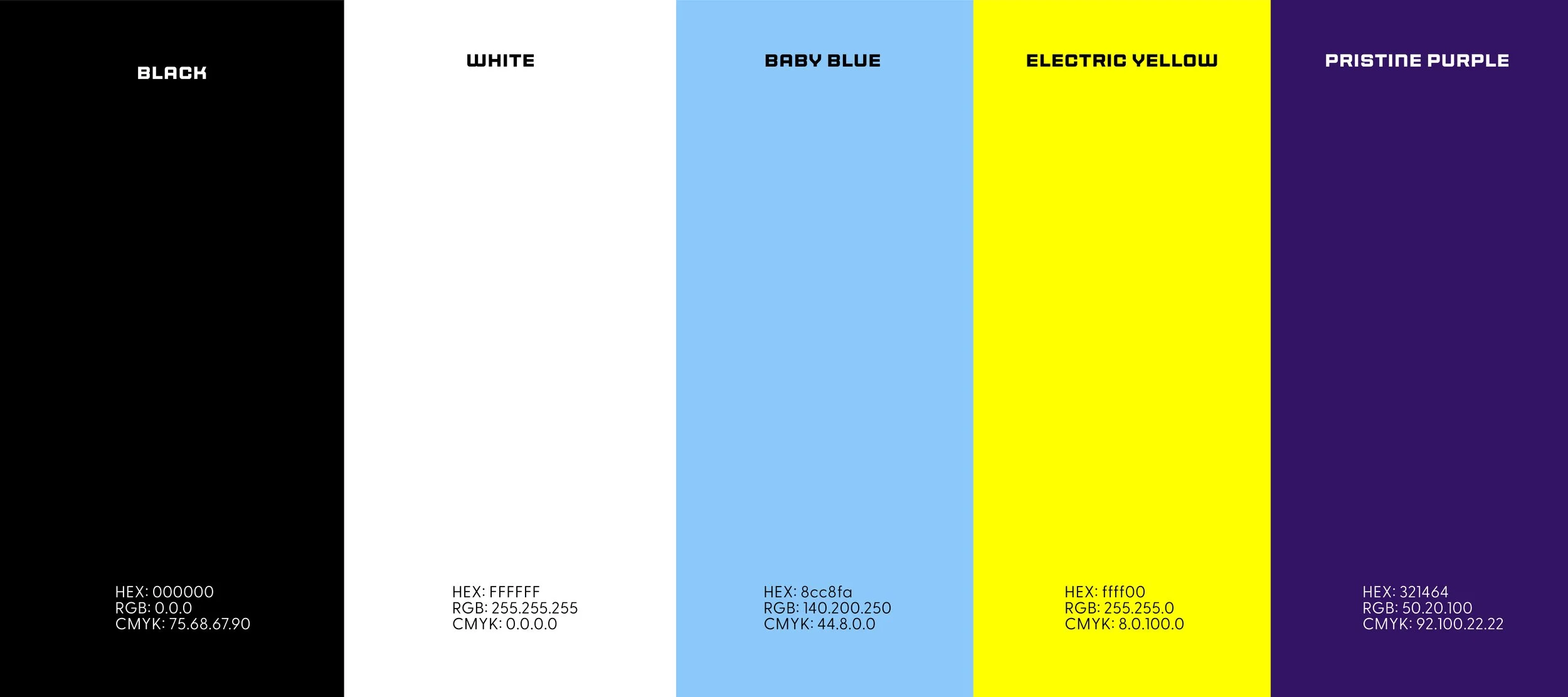
Most engineering firms rely on traditional blue, white, and gray color palettes. My client and I intentionally pushed against this norm by introducing bold colors and gradients designed to help BlinnTech stand out in a competitive market.