The Objective The goal was to create a visual identity for a Minnesota-based engineering firm that breaks away from industry norms. The client required a brand that stands out in a competitive field—one that is undeniably bold, functionally simple, and capable of unifying the diverse technical elements of the company.
The Strategy To achieve this, we developed a "Tech-Forward" system centered on high-impact contrast and geometric precision:
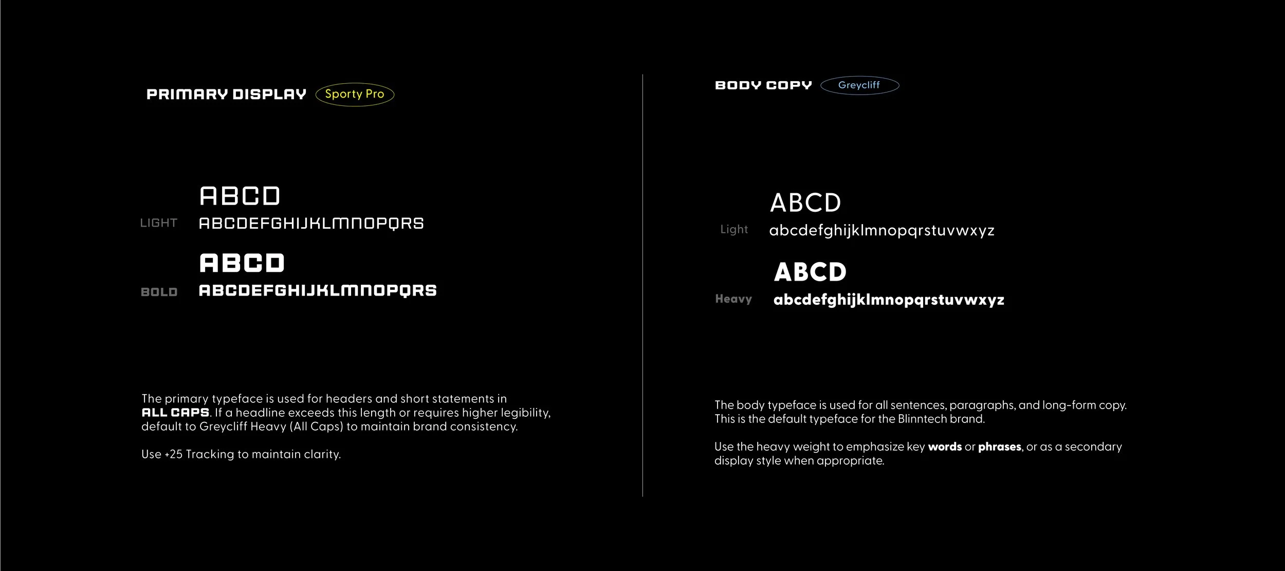
Bold Visual Impact: We selected Sporty Pro as the primary display typeface to provide an aggressive, athletic energy that traditional engineering firms lack.
Simple Hierarchy: To maintain simplicity and readability, we paired the bold display style with Greycliff, a clean sans-serif used for long-form copy and technical data.
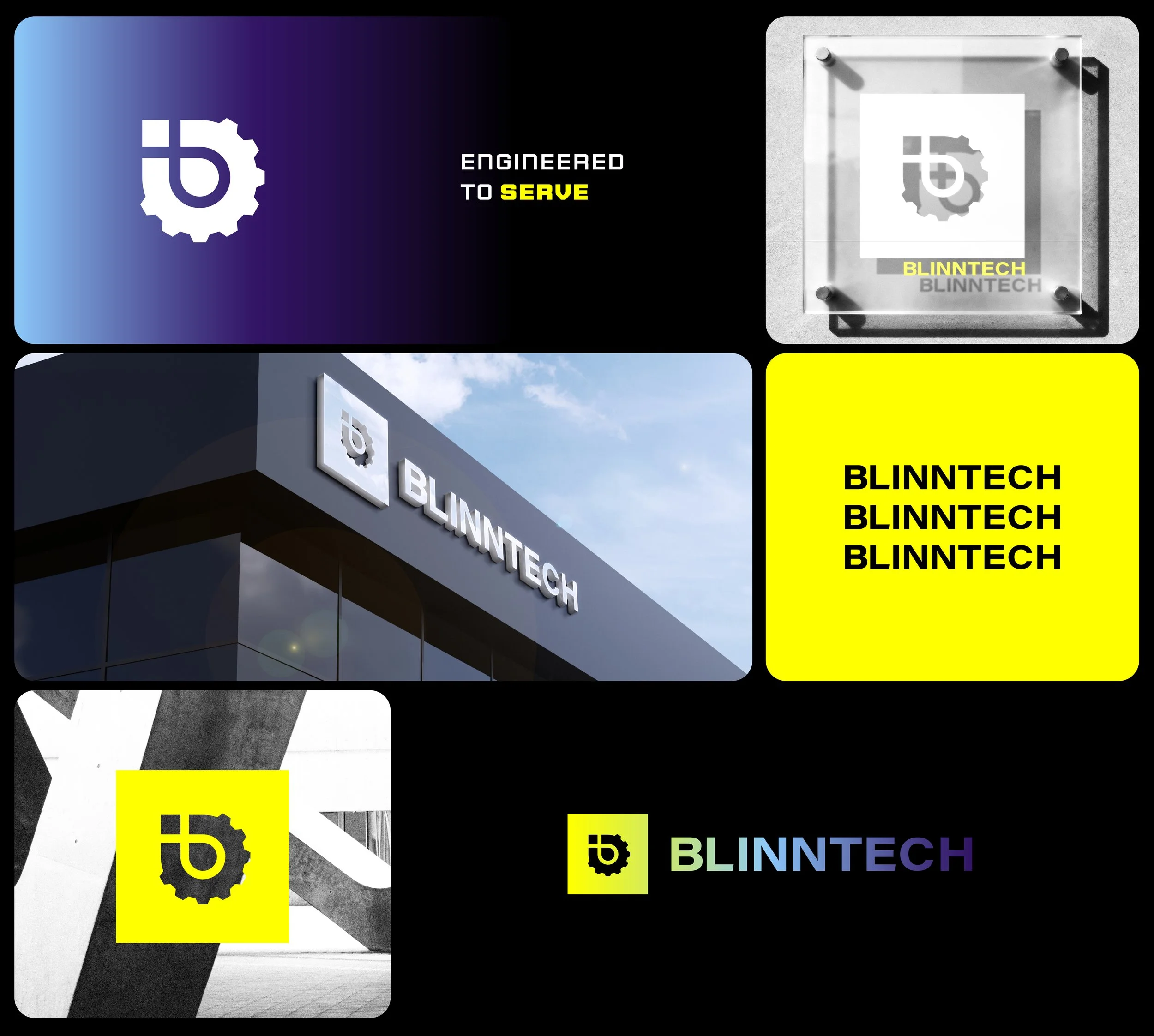
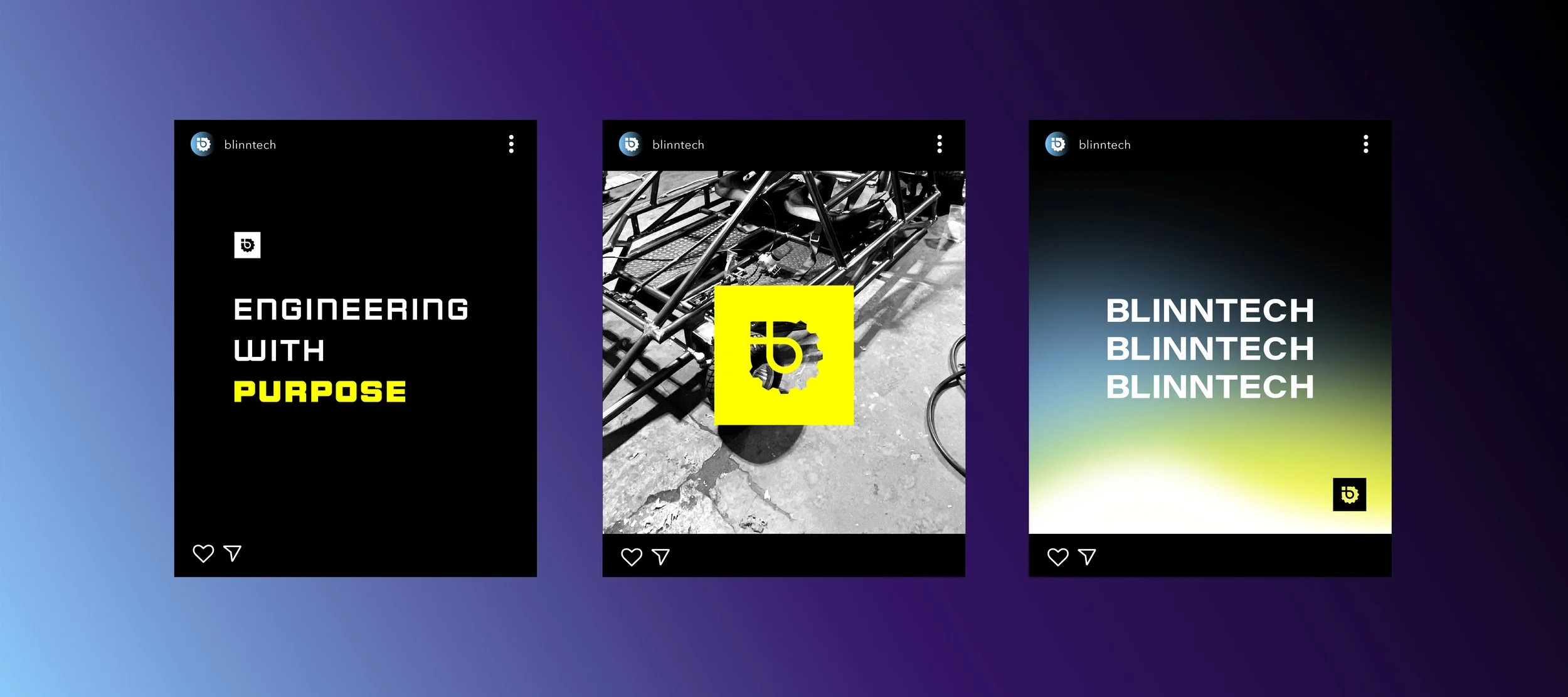
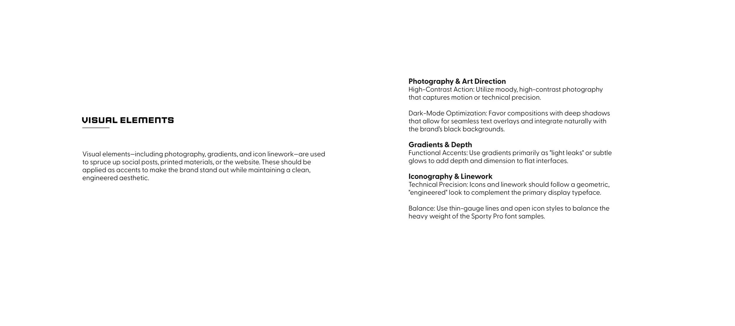
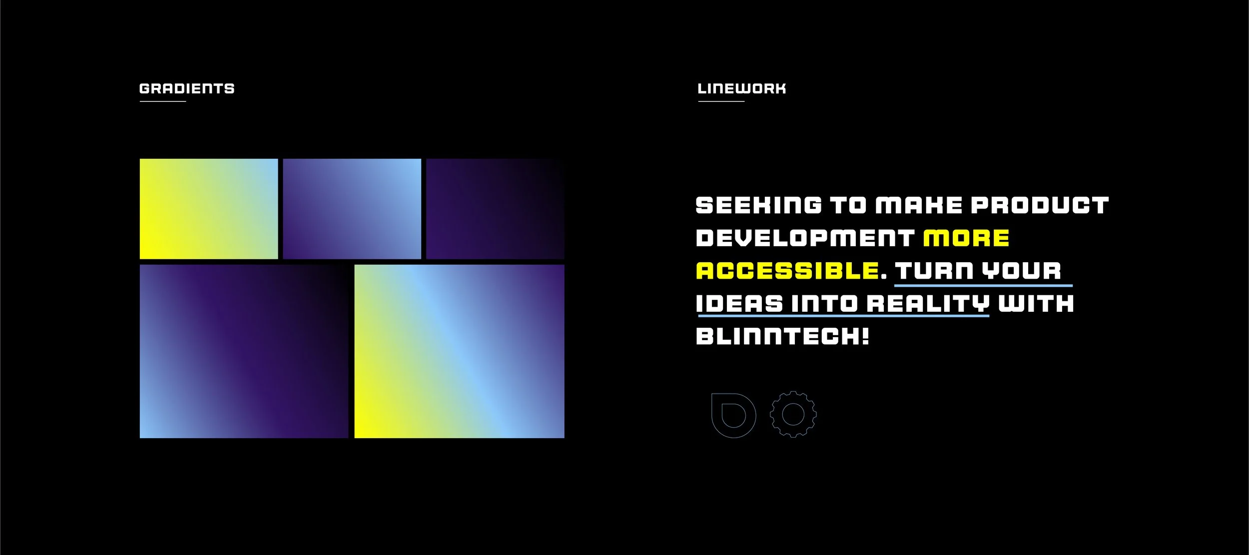
Unified Accents: We introduced technical linework and gradients to serve as the connective tissue across all brand touchpoints, ensuring a cohesive look from printed materials to digital interfaces.